100% Pure New Zealand Honey
Client: Forage & Gold
Location: Cromwell, New Zealand
Industry: Food
Photography: @julia_graycreative
Dishes: @moreishkitchen
Model: @wanjaswildones
Website: @myagencynz
Location: Cromwell, New Zealand
Industry: Food
Photography: @julia_graycreative
Dishes: @moreishkitchen
Model: @wanjaswildones
Website: @myagencynz

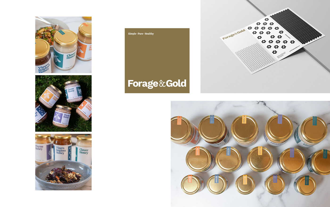
Forage & Gold has been created with the next generation in mind. Packaged in glass jars, with the same great taste and the option to return your packaging for re-use. They want to create a honey company that has as little impact as possible while delivering delicious honey, and providing ideas and suggestions for everyday use.
For the visual identity, we were inspired by the essential elements of this category. The hex pattern of a honeycomb's morphology fascinated us, and we were excited to experiment with the open and capped honey cells to create a visually appealing graphic outcome.
Forage & Gold's brand identity stands out in this highly competitive category with its simple and powerful visual language. The design exudes a vibrant, reliable, and fun personality that resonates with the audience. The label design is straightforward yet coherent throughout the product range, making it easy to create future products. In contrast, using a triple side label for different display options gives the brand a unique edge.
In summary, we achieved an aesthetic that balances tradition and modernity.
www.forageandgold.co.nz
Our Work
Brand Design
Concept Development
Packaging Design
Visual Identity
Illustration